The Cause & Effect Diagram is a popular tool and it appears in most continuous improvement projects. But in reviewing the project examples and publications, I am amazed at how many different ways this tool is utilized.
No one can say there is only one correct way to use any tool, although certainly some approaches are more useful than others. For me, the test of any tools usage is “does it provide the user with information about the current system.”
Does it provide the user with information about the current system?
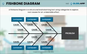
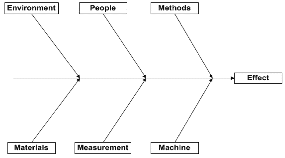
Let’s start with a definition of what this tool is. A Cause & Effect Diagram is a visual tool that aids in identifying the sources of variation within a process. The graphical layout is easily identifiable, often referred to as a “fishbone diagram” or the “Ishikawa diagram.” It has the effect labeled in the right hand box and is connected with branches or “bones” on which causes are listed.
The steps to create this diagram are typically listed as:
- Document the effect
- Label the branches/bones
- Brainstorm for potential causes and add them to the branches
- Identify the most significant/probable cause(s)
While accurate in what you do, they don’t provide much assistance in how to do this. Here are four ways the Cause & Effect Diagram (C&E Diagram) can provide more information:
- Label the cause “bones” with categories that are process specific
- Document the “effect” to show process variability, not the defect condition
- Use “causal” wording that is measurable or quantifiable
- “See”/visualize the correlation of the causes to the effect
1. Label the causal “bones” with categories that are process specific.
The diagram is typically shown with six branches and labeled with the six generic causal categories. Sometime these generic categories are referenced as 6Ms or 4Ms, a P and an E (as Manpower is relabeled as People, and Mother Earth is relabeled as Environment). Certainly, these typical settings are logical in that they represent the categories of variation that exist for any process. But their use is not mandated. Both the number of legs and the labels can and should be modified to fit the process under study.

In working with a variety of processes, I find that these typical settings can be limiting to the improvement team.
In transactional processes, for example, sometimes “Machine” can be difficult to understand. Changing the branch name to “Computer Software”, “System”, or even the specific application name can aid in understanding and identifying the variation.
Eliminating the “People” label and replacing it with multiple branches, each with specific job functions, such as “Operator” or “Design Engineer,” can provide more clarity and space.
Eliminating the “People” label and replacing it with multiple branches, each with specific job functions, such as “Operator” or “Design Engineer,” can provide more clarity and space.
Similarly, “Materials” may be better served by relabeling or adding more branches for specific process materials.
“Methods” may be better understood as “Standard Operating Procedures” or other forms of process documentation.
Finally, I find that teams may not clearly understand the “Environment” or “Measurement” branches. “Environment” is typically interpreted as the physical environment, which may have little or no impact on the listed effect. Opening the branch to include the “political” or “emotional” environment can be useful; however, it remains process dependent.
Measurement variation is many times overlooked in process analysis and can be significant. Spending time with the team to discuss the definitions to these branches can be useful in identifying the sources of variation they hold, but I must admit that space on a single page C&E diagram can be a limitation. On occasion, combining these into a single branch labeled as “Other” has seemed the best solution for the team.
Historically, C&E diagrams were hand drawn. With the advance of graphical software applications, many diagrams are now electronically formatted. Limiting a cause & effect diagram to a single piece of paper is an unnecessary constraint. Expanding the diagram to multiple pages can allow the number of branches to be expanded and thereby increase the analytical value of the tool.
How often is this currently practiced? When is the last time you saw a two-paged C&E diagram or one with more than six branches?
Expanding to multiple pages allows more space so that multiple “causes”can to be included.


I have watched a team waste time during brainstorming the initial creation of this tool by debating which category a given “cause” should be placed. Given the goal of this tool is to identify causes of variation, rather than debate the issue, label it in any, both, or all locations and later use data to determine which category is really appropriate. Expanding to multiple pages allows more space so that multiple “causes”can to be included.
2. Document the “effect” to show process variability, not the defect condition.
In almost all of the cause & effect diagrams I see, the effect is labelled with the defect condition from a single process event.
When “cycle time too long” is the listed effect, the mental picture I have is a condition from one end of the distribution, rather than the variation of the total distribution.


Figure 3 depicts the output variation. Certainly the specification or a service level agreement can establish the defect condition, but by labeling the C&E diagram effect in this way, do we limit the thinking about the causes? How can we understand all the causes of variation in cycle time if we only think about the times that are beyond the specification?
To me, the C&E diagram implies correlation, even if it cannot be easily measured.
“Causality (also referred to as causation) is the relationship between an event (the cause) and a second event (the effect), where the second event is understood as a consequence of the first.”
If this is true, then shouldn’t the C&E effect diagram help us visualize that correlation, not just the conditions when the defective result occurred?
Adding a cause to a branch on the diagram implies it is a contributory cause. That means, when the cause is present, one would expect the effect will have a different outcome result than when it is not present. If this is true, then shouldn’t the C&E effect diagram help us visualize that correlation, not just the conditions when the defective result occurred?
I believe this is more than mere semantics. I believe it has an impact on how the causes are listed and labeled. It is a simple change. The labeled effect becomes “cycle time varies”. In making this change, the total variation is more in focus. I start to explore why and when cycle times are extremely short, not just the small segment that are defective.
3. Use “causal” wording that is measurable or quantifiable.
When a team is brainstorming causes, there is a tendency to add a qualifying adjective – “training” becomes “lack of training”. Other qualifying words like “inadequate,” “improper” are commonly observed.
I believe using these words transforms it from a cause to an implied solution. Does not “lack of training” really mean, if we provided more training the effect would not exist? It moves the team away from confirming the correlation to simply implementing a solution.
If one buys into changing how the effect is listed (to show variation – section 2 above), then changing the wording on the listed causes to measurable or quantifiable descriptions strengthens the correlation message.


For example, if “lack of training” implies the solution of providing training. By asking, “What would training change?” – one may provide an answer such as “operator knowledge”. Isn’t the “level of operator knowledge” really the type of cause we are looking for?
Ideally, all causes listed should be measurable. “Lack of Training” is not. “Operator knowledge” is measurable, albeit difficult. If the intended purpose of the cause & effect diagram is to list sources of variation, with the cause written as “Operator Knowledge”, one can envision a distribution of knowledge among the operators.
I suggest working with the team to eliminate these qualifying adjectives. “Procedure not followed” becomes “% of procedure followed” or some other means of measuring the difference from one process cycle to the next. “Inadequate staffing” becomes “number of man-hours utilized.” These causes are measurable and again I would expect there to be measurable variation from one process cycle to another.
Some causes are attributes in nature. For example, a cause such as “location” would imply that variation existed from location to location. In this example, the procedure is an attribute. It is an individual entity without variation – a specific version of a given document. These types of causes still work for me, but how I analyze the data simply changes. If I have two locations or two different procedures, I simply collect output data and stratify it by the attribute and use a hypothesis test to check for statistical significance.

Using these re-wording suggestions, the revised cause & effect begins to look like the Figure 5.
In situations where I have used these first three suggestions, the team found the diagram easier to understand and thereby more useful.
4. “See”/visualize the correlation of the causes to the effect.
Now, with wording that implies variation in the output (effect) and the inputs (causes), the next step is to validation the causes with data. With the possible correlation more visible from the diagram, the use of multiple regression, ANOVA, and hypothesis tests can begin to provide actual statistical evidence of the relationship. I challenge the team to draw what they would expect the correlation to be, even if they are yet to collect the data.


In some cases, collecting the data may be challenging. How do you measure the operator’s knowledge? But I do find this correlation discussion, even if only hypothetical, goes a long way in gaining knowledge about the process. You will find that many times, another “Why” question is generated, and then the “5 Whys” analysis really becomes meaningful.
The Heart of Your Process Improvement Effort
By utilizing these four suggestions, I think the C&E diagram becomes the heart of any process improvement effort and provides key learning that should be carefully retained and not be lost simply because personnel move onto other positions or subject matter experts retire. I believe it will greatly increase the leverage you get from this tool.
What is your experience with the Cause & Effect Diagram? Please share in the comments below. We’d love to hear about your successes and challenges!


