What’s a Pareto Chart?
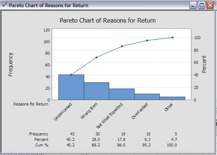
A Pareto Chart is a quality chart of discrete data that helps identify the most significant types of defect occurrences.
It does this by showing both frequency of occurrences (bar graph) and cumulative total of occurrences (line graph) on a single chart. The type of occurrences are organized on the X-Axis from highest to lowest frequency. Respectively, the left Y-Axis shows frequency of occurrences, while the right Y-Axis shows the total percentage.
Learn more about Pareto Charts in Green Belt Training.
How to Create a Pareto Chart in Minitab
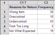
Download the GoLeanSixSigma.com Pareto Chart Data Set for Minitab here.
1. Open Pareto Chart Data Set:
2. Go to Stat > Quality Tools > Pareto Chart:
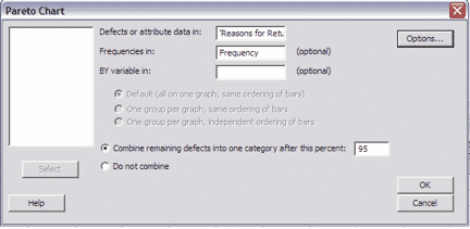
3. Click “OK”: