Home » Blog » How to Run an X-Bar & R Chart in Minitab
What’s an X-Bar & R Chart?
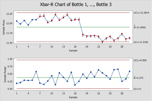
X-Bar & R Charts are Control Charts designed for tracking the average of sub-grouped continuous data. They consist of two separate charts; “X-Bar” stands for the “Average” Chart which tracks the mean of sub-groups of up to 6 data points and “R” stands for “Range” Chart which tracks the difference between the maximum and minimum values in the subgroup. These charts are not as sensitive to non-normal data as the I & MR Charts.
A classic example of an X-Bar & R Chart is to track the average cycle time to deliver packages by sampling 5 packages per day.
Learn more about X-Bar & R Charts in Control Phase, Module 6.2.2 of Black Belt Training.
How to Run an X-Bar & R Chart in Minitab
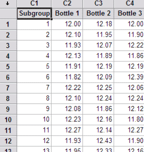
1. Select Raw Data:
2. Go to Stat > Control Charts > Variables for Subgroups > Xbar & R:
3. Select “Observations for a subgroup are in one row of columns”
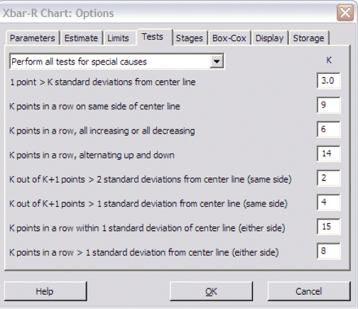
4. Click on “Xbar-R Options:
5. Click “OK”
6. Click “OK” again:
To learn more about X-Bar & R Charts, register for Black Belt Training and review Control Phase, Module 6.2.2.