
“Magic arises from the illimitable mysteries of cause and effect; to witness the effect is to surmise the cause.” – Teller (Penn & Teller)
There are many approaches to finding root causes. Perhaps none are as effective, and satisfying, as “finding the smoking gun.” This means finding the effect of the root cause right where it happens, or very close by.
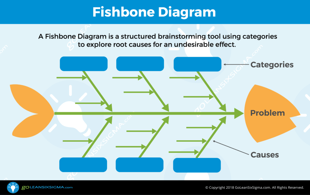
The Fishbone Diagram is one of the more popular tools for root cause determination and can be effective if created by people with first-hand knowledge of the process — provided they are guided by data and observations from the process. All too often, however, the Fishbone Diagram degenerates into a structure to simply organize brainstorming ideas. They key is to use evidence of issues to populate the Fishbone Diagram.
Often, evidence of a problem comes from process performance data long after the problem occurred. For example, the discovery that last week’s performance was unacceptable can be a long way from the scene of the crime.
Find It in the Process
We need to go to the gemba (the place where work happens) – conduct a Process Walk and look for evidence. We know the problem happened somewhere in the process, but where? As we view the process, we look for signs of variation – anything that seems different from one item to the next. Visual differences are the most obvious, but any variation you can sense may be the difference that makes a difference!
- When you first see the problem, carefully note where in the process you first saw it. This may not be where it actually occurred, but it allows you to rule out all process steps after the one where you found the problem.
- Next, look upstream for other instances of the problem. If you find them, you can rule out steps downstream of that point.
- When you reach the earliest point in the process were the problem was identified, carefully examine exactly what is happening in that step. Depending on the type of process, you may need special equipment for this, like a high-speed camera or precision measuring equipment.
- This is when you want to behave like the irritatingly persistent Lieutenant Columbo (without the cigar, please). Ask every question you can to accumulate clues. People working the process may have the answer without even knowing it, so ask – ask – ask!
- Unlike the quote from Teller above, there is no magic here – only physics is at work, so look for physical influences that could be the root cause.
- If you think you have a root cause, determine how you can turn it off or neutralize it – at least temporarily. Once you can turn the suspected root cause off and on again, see if the problem goes away and returns. If you can turn the problem on and off, you probably have the root cause, and with a few statistical tests you can prove it so.
Ask every question you can to accumulate clues. People working the process may have the answer without even knowing it, so ask – ask – ask!
A Tasty Example
A snack food company makes crackers that are packaged in tubular plastic sleeves containing approximately 35 crackers each. Four sleeves fill a 16 ounce box, but the box consistently weighs more than 16 ounces – why? There is variation in the weight of the crackers, along with the requirement not to ship underweight boxes. As a result, the company deliberately ships slightly overweight boxes to avoid noncompliance. The company is essentially giving away a small amount of product in every box because of imprecise control over product-weight variation. They made many attempts to improve weight control, and they sincerely believed that weight variation was as good as could be achieved. Now let’s look at the process.
The Case of the Heavy Crackers
The process starts with dough in a hopper feeding a series of rollers that produce a four-foot-wide sheet of dough. The sheet is then cut into 22 rows of crackers across the four-foot-wide conveyor. The crackers proceed through an oven and are then packaged into sleeves and put into cartons. After carefully watching the process, we determined that we could trace any sleeve back to the row that produced the crackers. We weighed sleeves from each row and found that sleeves from row #1 were significantly lighter than those from row #22. The other rows had sleeve weights in-between and followed a general trend of being heavier as the row number increased.
Digging into the Dough
We knew we were on to something, but row number itself was obviously not the root cause – the root cause was likely something related to position on the conveyor. Something was happening differently across the conveyor. We confirmed that the number of crackers in the sleeves were the same, so we knew that individual cracker weights were varying. After careful examination of the process, we wondered if somehow the dough on one side was heavier than on the other side.
We asked the operator to take a sample of the raw dough just before the crackers were cut. They had a device that cut a circular piece of dough out of each side. When we weighed the two samples we found that the dough was heavier on the side that produced the heavier crackers. This is an example of working upstream in the process to approach the root cause. Finding that the dough was heavier meant the problem was not occurring after the crackers were cut.
The Roller Was Not “On the Level”
Discussion with the operators led to the suggestion that the dough might be thicker on one side, which could happen if the leveling roller was not truly level. They called Maintenance who adjusted the leveling roller until the dough weights matched. This greatly reduced sleeve weight variation and allowed the company to reduce the amount of excess product in a package.
Find the Smoking Gun in the Data
I recommend examining the process directly to find the smoking gun. Sometimes the process isn’t nearby, but at least you can review data from the process. If the process is far away, I still suggest a visit to the process, but until you do, process data can be revealing.
When we gather process data, we also gather other information with which we can stratify the data, looking for patterns. Patterns are the key here. If there is no root cause at work, we expect to see a random pattern when we plot a run chart, or a hump shape (possibly lopsided) when we plot a histogram. These random patterns naturally happen when nothing noteworthy is going on. However, if we see any non-random patterns, that is “news we can use” because very likely a Root Cause is operating nearby.
When we gather process data, we also gather other information with which we can stratify the data, looking for patterns. Patterns are the key here.
Non-random patterns might show up as:
- Trends in the data pattern
- Cycles
- Clusters or abrupt shifts
- Extreme outliers
- Multiple “humps” in the histogram
There are other possibilities as well, but these are some of the more common examples. If you find a non-random pattern and can identify when it happened, you can look for clues to find the cause.
Checking for Patterns in the Baseline Data Display
Most improvement projects aim at increasing or decreasing some output of the process. I always insist on a baseline run chart showing process performance for six or more data points – more if data is readily available. More often than you might expect there are some data points within this baseline period that are close to the goal of the project. When this happens, it is important to determine what happened differently at that point and attempt to replicate it.
The following is a Run Chart of product weight:

These weights were taken by drawing samples from the process every 50 units. Most of the data looks random, but there are two important clues here; the first is five rather extreme low outliers, that happen to occur about 50 samples apart. This is simply too coincidental to be a coincidence, so we immediately suspect a cause at work. The second is that the process ran for over two hundred observations, and then began to produce regularly spaced outliers, and then stopped doing so at about 375 observations.
These are not smoking guns, but they do give us clues to help us when we visit the process. Since the outliers occur at intervals of 50 samples, and each sample is taken every 50 units, then something is happening every 2500 units (50 x 50), so we make inquiries as to what that might be – possibly a break, shift change, or some other process disruption. If we can connect a date and time to each observation, we know when the process change that produced the outliers started and ended. When we examine what happened during that time we may find clues to the cause. If we can find the cause and fix it, we can eliminate the extreme outliers in the future.
If at First You Don’t Succeed, Stratify!
When we look at an overall Run Chart it may appear completely random, but when we stratify the data, a different story may emerge. If we gather information while grouping the data by some factor, such as location, shift, day of week, etc., we may find some surprises.
We had data from a project that sought to reduce the cycle time of a business process. The Run Chart looked random, but when we looked at the performance of each of the twelve people working in the process, it told a different story:

This graph is the output of a one-way ANOVA and shows the average time (and 95% confidence intervals) for each of the twelve people. Note that there is a lot of variation, but the biggest difference is between person 7 and person 10. We might be tempted to blame the person. We might decide to “light a fire” under person 10 — problem solved!
WRONG! Instead, we studied the processes of the two people with the highest and lowest cycle times and identified what allowed person 7 to be so much faster. Then we taught that process to person 10, who was able to reduce their time substantially. This, along with other process improvements, was extended to all the other participants resulting in even greater overall improvement!
The Bottom Line
Unless it is absolutely impossible, you must go to the process and see for yourself! If you cannot find a smoking gun during your first process observation, look for clues in the data from the process. Let your senses and the data “tell” you where the smoking gun is likely to be and go find it!